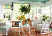
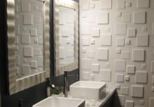
So you want to re-decorate? Maybe you are sick of your neutral magnolia or white walls, or are you living with a colour scheme chosen by the previous tenant? One way to bring a room together is to choose a colour scheme – colours that complement one another or work together in some way. But if you are a little scared of taking the plunge and going for colour, you are not alone, choosing a colour scheme is one of the most often cited as one of the most difficult decorating decisions.
Variations on a theme
The easiest and most obvious (but effective) way to find colours that work together is to choose variations on a theme – different shades of the same colour which can range from dark to light. This works especially well for blues, reds and pinks and is great if you aren’t very confident about the way colours work – or if you have an absolute favourite colour that you know you want to use.
Colour themes or palettes
Another way to find colours that work well together is to choose a theme from nature – for example spring (greens and yellows), autumn (reds, oranges and browns) or nautical colours (blues, greys and greens).
Complimentary colours
Complimentary colours are an option if you are feeling a little more adventurous. These are colours that naturally complement one another (in other words work well together). A good example is green and red. Complementary colours are colours that are opposite each other on the colour wheel. You can buy a colour wheel from an art or DIY store, print one out from the Internet or make one yourself if you are feeling arty.
Working with what you have
If you are on a budget and don’t want to change any your furnishings to suit your colour scheme, or you are less confident about colour use you might want to use your furniture and accessories as inspiration for your colour scheme. Look at the main colour in curtains, sofas, cushions and throws and chooses something similar. It might help to take a photo of the fabric so that you can take it with you to the DIY store to compare with paint charts and wallpapers.
Clashing colours and patterns
Of course if you are an artistic or eccentric type you might not want an overly coordinated look. You might want colours that class or contrasting patterns. In this case pretty much anything goes – choose bright, bold colours and busy, striking patterns.
Experimentation
The key to successful home decorating is really experimentation. Match pots (obtainable in most paint outlets) and wallpaper samples are great for trying out colour and pattern in your room before you take the plunge, and are also good for comparing colours to furniture and fittings.
Think about what will work for your space – dark colours tend to make a space look smaller and light colours open a smaller space out. Busy wall paper can make a small space seem smaller too. But really it’s down to personal choice.
Sam Wright is a freelance writer working for HGS Painting and Decorating