


Even though colour is part of our lives and around us every day, not everyone has an eye for what combinations of colour works or how to use colour in interior design, for instance. Colour is an important and essential element of the overall design, and not just when considering aesthetics.
Colour in interior design has a strong impact on us, as it does in any surroundings. On a simplistic level we feel we have favourite colours and colours that we dislike, or even hate. However did you ever think about why the impact can be so dramatic? You know the feeling of walking into a room and you either feel better in yourself suddenly or at the other end of the scale, you may feel repulsed and feel the need to get out of the room as quickly as possible. Colours are vibrations and across the spectrum of colours visible to the human eyes, these vibrations have a variety of effects on us.
A talented interior designer who speaks the language of colours fluently, knows almost instinctively how to put certain colours together, and set the perfect ambience up for the feel and purpose of the room in question. Someone with this kind of talent can manage to put a colour you dislike into a room, but by adding in another colour cleverly, you may actually feel comfortable there, even though it surprises you.
So much in the same way as colours are vibrations, how they play off each other brings new sets of vibrations. In a way it is not unlike food. An inventive chef who has an amazing gift of putting together flavours that we would not have expected to sample in one dish is doing something similar. It is a question of knowing instinctively how to blend vibrations with each other, so that they create harmony.
It has been well documented that colour has a great effect on the human psyche, our feelings and our moods. For example, red is known to be stimulating, while green is restful. Blue is seen as a cool colour and orange imparts energy. When it darkens toward terracotta, however, it then becomes a warm and relaxing colour. It can be a bit challenging to determine which shades and tones to use in certain areas, since there are so many choices.
Some people also have difficulty figuring what colours and shades combine well in fashion, as well as trying to coordinate colours within the home. If colour is not used correctly, it is not only impossible to create an elegant and luxurious look, but the wrong colour combinations can feel like an assault on the senses.
Not only does colour in a home have psychological impact, but the various shades and tones can also alter one’s perception of the room size as well. If two rooms of exactly the same size are finished in different colours, they will be perceived as different sizes. In fact, it is amazing to learn how much colour in interior design changes perception.
The way in which colour in interior design is used in a home is also important for practical reasons. For example, if there are children or pets in a home, interior designers recommend avoiding light shades such as white or cream for upholstery or carpeting.
However, the practical considerations should not be the only reason for using certain shades of colour in interior design. It is always important to take into account the aesthetics of your home and how it fits your lifestyle and preferences as well. It is simply a matter of balancing the practical and the beautiful within the wide range of choices available.
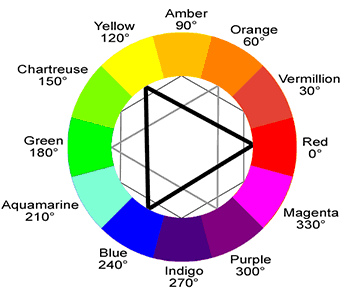
What will help is knowing which colours are complementary. Check out this complementary colours wheel, the ones opposite to each other are complementary. Then the best way forward is to practice and build your confidence over time. One methods of doing this is to choose the colour you feel you would like as the main colour in a room. You can use it on some or all of the walls, this will depend on what else is happening in the room, such as furniture materials and colours, and all light fittings and settings. Some people may prefer to leave one or to walls a less dramatic colour, even white, and then see how the room feels over time. What you can then do is inject a little of the complementary colour into the room, and this works very well. It gives a style and good feeling when done subtly.
Featured images:
 License: Creative Commons image source
The author, Jackie, loves decorating and has always been fascinated with colours. She found one great way to add a small bit of a complementary colour to a room and this is by using Bombay Duck door knobs. The range is vast and it is an inexpensive way to make a room stylish, using colour in interior design well.

Related Articles


-
EleanorFayNicholson
 Purple Base Color - Tri-Color Representations
 Yellow Base Color - Tri-Color Representations
 Red Base Color - Tri-Color Representations
 Pink Base Color - Tri-Color Representations