


The term ‘spring clean’ can apply to many things including tidying the house, detoxing your body and even freshening up your home interiors with a lick of paint and new colour scheme. But which colours are on-trend this season?
When you decorate your home, it’s important to consider what the room is used for. Is it a playroom? Study? Bathroom? Depending on the room use, you may want to choose colour schemes accordingly. According to psychologists, different colours can have a different effect on our moods. When the eyes see certain colours, messages are sent through the optic nerve to the brain and trigger emotions. So, which colours will you pick?
Lemon yellow
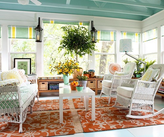
Yellow is the classic spring time colour. It’s the colour of blooming daffodils and all things warm and bright. So naturally, yellow would be a great spring colour choice for any room. Yellow is believed to stimulate feelings of optimism and happiness, making this a suitable colour for most room uses. However, be careful which shade you choose. If you choose a bright citrus yellow, be sure to use it only as an accent colour, perhaps for blinds or cushions and other accessories. This would also make it easier to change a colour scheme later in the year. However, this citrus shade works perfectly with light greens and cream neutrals for a bright springtime treat. Darker orange/yellows can be stifling in the summer months and, again should be reserved for accessories.
Navy
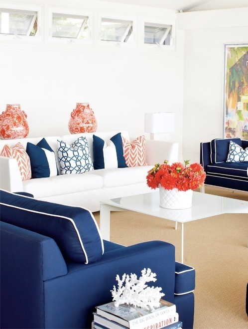
Navy is an unusual addition to a spring trends list but is making a prominent appearance in interiors this season. Primarily combined with white, this can add a crisp, urban feel to any room. In terms of room use, it would be best used in a study because blue is believed to stimulate emotions of calm and tranquillity. When the eyes see blue, the brain is also believed to sense connotations of intelligence and reliability, the perfect colour for an office in which you hold business meetings. For a nautical feel, try softening the room with striped cushions or blinds. If you choose a dark shade of navy, try to keep most of the furniture white and always paint the ceiling and skirting in white to give the room an extra lift.
Duck Egg blue
Duck egg blue has become a popular colour. Once popular in mid-nineteenth century parlours, this shade has been given a modern comeback when combined with neutrals and accents of apricot. Try duck egg blue as a colour in the nursery for a bright, gender-neutral colour that will last for more than one season. It is a great versatile shade because it works well with other shades of blue and green and especially white. Try painting an accent wall in this pretty colour for a refreshing spring update.
Apple green
According to psychologists, when the eyes see green, the brain links it to connotations of fertility and nature. As spring is the season of fertility and new life, it would be the perfect colour to bring life into your home. As a kitchen accent colour, try choosing cushions and blinds in this pretty shade. When combined with delicate florals, apple green can be an uplifting colour to brighten any room. For a braver design twist, use with accents of peach but be sure to use sparingly to avoid an overpowering colour clash.
So as we prepare to jump into spring, consider which colours will suit your room style and how this simple change can transform a room from a cosy winter hideaway to a bright spring living space.
Victoria enjoys blogging for prescription glasses retailer, DirectSight.co.uk.